Geezer
-
Posts
2,813 -
Joined
-
Last visited
-
Days Won
93
Content Type
Profiles
Forums
Gallery
Downloads
Store
Everything posted by Geezer
-

From the album: WW2 Stuff
-
I know exactly what you're going through! I have the same problem with my Hurricane Mk1 landing gear - I can't get all the animated parts to move in unison. Bummer...
-
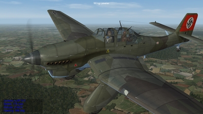
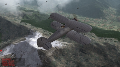
Lightening and dulling colors applies to everything else in the TW gameworld. Shot below shows lightening/dulling applied to map stuff. The trees have been adjusted about 10%-15%. Also, Gterl's ground tile art has been lightened and dulled a bit - IIRC, around 5%. Also, below the right hand wheel spat is a straight line with sand brown on one side, and olive green on the other. To the left of that line is a new WIP tile I am working on. Gterl's tiles are 512x512, but the WIP tile is 1024x1024 and looks more convincing when flying at low altitude.
-
From the album: ART101 For Modders
-
From the album: ART101 For Modders
-
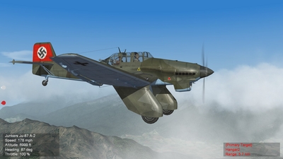
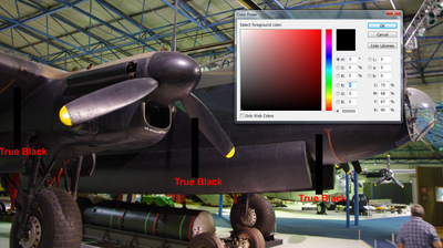
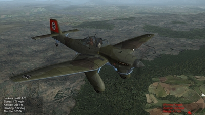
A couple of guys have wondered why my stuff looks so "real." Before returning to aviation in the 1980s, I graduated from a professional art school and had to learn both scientific theory and the techniques of the masters (DaVinci, Rembrandt, etc) to paint realistically. I thought I'd pass on some basic information that will assist you guys in making more realistic mods. First, leave your preconceptions at the door and approach the subject of color theory with an open mind - the odds are, what you think you know is wrong. First, we start with the science. What we call color is reflected light at different frequencies. Every color has a unique frequency which travels through the real world until it is detected by our eyeballs. The real world usually affects these frequencies as they travel through the atmosphere, and shifts them slightly before they strike our eyeballs. These frequency shifts, and other phenomena, create optical illusions that are part of the world we live in. Understanding optical illusions is crucial to creating realistic art. We have all seen railroad tracks converge to a point on the horizon. Your mind knows the tracks are the same distance apart at the horizon as they are at your feet, BUT THAT IS NOT WHAT YOUR EYES SEE. Creating realistic art requires you focus on what your eyes see, and ignore what your mind tells you. Lets say you want to make some new skins for an aircraft. You do careful research and identify some accurate colors, then use a paint program to take samples of those colors, and then start painting the new skins. You just screwed up! Because of the frequency shifts that happen while light is traveling through the atmosphere, the colors seen by your eyeballs seldom match color samples. Yes, your mind knows those color shifts are not "real" but so what? If you want to make realistic art, the only thing that matters is what your eyeballs see. A color frequency consists of three things: - The color itself - is it red, or blue, or green, or whatever. - The saturation of the color - is it vivid or dull. Think of the difference between vivid fire engine red and dull brick red. - The lightness/darkness, called "value" in the art world. The bottom line: because of frequency shift, most colors seem lighter and duller to our eyeballs. So, make copies of your color samples and then lighten the value of each color and also reduce the saturation of each color. OK, how much? It varies due to the situation. Is the noonday sun bright, or is the setting sun dull? Is there a lot of dust or water vapor in the air? It boils down to your own personal interpretation - that's why they call it "art." - If you like your aircraft looking like they just rolled out the paint shop door, then lighten and dull your colors just a little - say 5% to 10%. - If you like your aircraft looking like they have been used but well cared for, then lighten and dull your colors 10% to 20%. - If you like your aircraft looking like they have been beat to hell, then lighten and dull your colors 20% to 30%. To illustrate how these factors affect "realism" let's look at value. NEVER use true black or true white as a general color because THEY SELDOM OCCUR IN NATURE. That's because black and white aren't colors, they are values. White is a combination of all light frequencies, while black is the total absence of any light whatsoever. These conditions - all light or no light - are quite rare, but most people don't know this. What most people describe as black or white is actually EXTREMELY DARK GRAY or EXTREMELY LIGHT GRAY. Shot below of "black" painted Lancaster shows how black seldom occurs in the real world. Note the strips of "true black" added in Photoshop. Close examination of the photo shows the picture is almost always a tiny bit lighter than the strips of "true black." OK you say, what happens if you turn out the lights and darken the hangar? Remember that black is the total absence of any light WHATSOEVER. So long as small amounts of light leak under doors, etc there is some light inside the hangar, so scientifically speaking, the hangar cannot be "black." So, why have I beaten the subject to death? If "black" is darker than any other color, but does not occur outdoors in the real world, then "black" in the real world is actually a slightly lighter dark gray - and all other colors appear lighter too because they are lighter than black. Note the use of black in publications and computer graphics is a form of style. Style is a variant of realism but is not realism itself. Try experimenting with any art you may have already made. Load the new art into the sim and see what it looks like. Below are two shots of MontyCZ's excellent Stuka art. The first is his original art unmodified. The second is his art that has been lightened and dulled around 15%. Another shot of lightened and dulled art, plus a little glossiness.
-
From the album: ART101 For Modders
-
From the album: ART101 For Modders
-
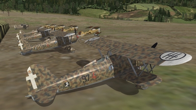
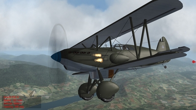
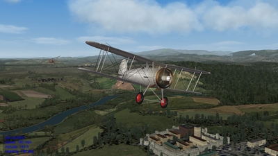
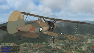
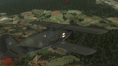
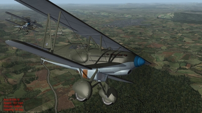
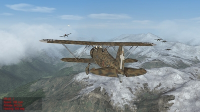
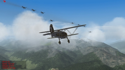
More examples of 1930s dogfights over the Alps. Only the Gladiator is unavailable right now - I hope to finish it in the next couple of months. The other aircraft are MontyCZ's Ju87A and AviaB534, Hinchinbrooke's Gauntlet, and my CR42.
-
From the album: WW2 Stuff
-
From the album: WW2 Stuff
-
From the album: WW2 Stuff
-
From the album: WW2 Stuff
-
From the album: WW2 Stuff
-
From the album: WW2 Stuff
-
From the album: WW2 Stuff
-
From the album: WW2 Stuff
-
From the album: WW2 Stuff
-
Thanks. Anybody can put together a 1930s dogfight situation using FE/FE2. There are lots of late 1930s aircraft in the SF1 download section - that's where I found the early Stuka. They usually drop right into FE2 if you alter the Aircraft Start Date in the aircraft data file to 1914.
-
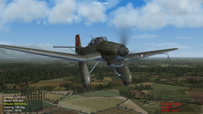
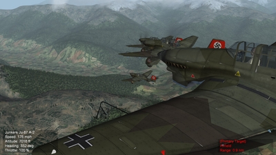
Had some fun this morning, experimenting with 1930s FE2. MontyCZ's excellent Ju87A looks great over Gterl's Alps. Because Italy and Germany were adversaries in WW1, the early Stukas are then jumped by CR42s.
-
From the album: WW2 Stuff
-

From the album: WW2 Stuff
-

From the album: WW2 Stuff
-
From the album: WW2 Stuff
-
From the album: WW2 Stuff