About This File
I occasionally tinker with lighting and textures to make the TW gameworld look more realistic. This small pack was developed to improve Gterl's WW1 Italy game map, but should also work with most any other SF or FE game map.
Most of the changes are located in the FLIGHT folder, whose contents are largely the work of Quack74. All I did was alter the light levels to better simulate "high noon" - the standard game settings are too dark and murky for bright sunshine.
I also lightened and dulled Jan Tuma's tree art so forests don't look like dark green blobs. The new art files Stromy, Stromy2, Stromy3, and TEROBJECT_TREE S1 replace the equivalents in the WW1 Italy folder.
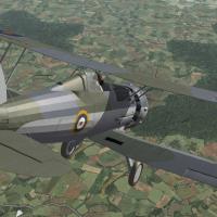
Finally, the increased light levels can make some aircraft appear too shiny. A sample texture set ini file is included with reduced glossyness settings - see first shot of Sea Gladiator (facing away from camera). 0.000 equals no gloss whatsoever.
Specular=0.200
Glossiness=0.200
Reflection=0.100


Recommended Comments
Create an account or sign in to comment
You need to be a member in order to leave a comment
Create an account
Sign up for a new account in our community. It's easy!
Register a new accountSign in
Already have an account? Sign in here.
Sign In Now