Julhelm
-
Posts
1,877 -
Joined
-
Last visited
-
Days Won
18
Content Type
Profiles
Forums
Gallery
Downloads
Store
Everything posted by Julhelm
-
I want to know how he can afford to start a completely new productline with new tech etc when he's always been so dirt poor that he couldn't afford to implement features we've asked for for years like air to air refuelling.
-
Those look good but you should be adding some railings to them. And while your textures now have proper shading, they still lack highlights which you have to work in. Then they'll look really good.
-
It really is stupid, this stating of "we don't do sims". ORLY?
-
lol Stary. Keep hoping. Judging from the latest posts TK seems more intent on further pissing on his core audience.
-
At the very least, he should fix the damned terrain. Seriously. IcelandNA is a riot.
-
Well said Diego. Unfortunately, I think the whole moving to tablets thing is a major miscalculation on the part of TK. He's probably looked at X-Plane and wants a piece of the pie, but X-Plane has a substantially bigger fanbase and marketing.
-
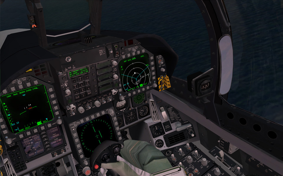
I'm just going by what I see on that screenshot Eric posted on page 63. Maybe it looks OK in max and photoshop but it looks overall too uniformly mid/dark grey in ingame screenshots and not dark grey/light grey like the real cockpit. And if you sketchup model shows them as on the same plane, look again at the photos I just attached. You can clearly see the bottom instruments are at least 2 inches deeper compared to the front of the MFD.
-
Also, don't know if you've noticed, but in the real cockpit, the MFD's and spin/jettison panels protrude out quite a bit further than you've modelled them. This too could be a reason why it kind of lacks the depth it should have? If you bake AO the shading won't be correct in that case. I've made the same mistake before. It's easy if you look at pilot POV photos too much :) Check how Aeyes placed them, and the pics I'm attaching below:
-
Over 30? Damn. I have to say, one huge problem I tend to run into when working with lots of different textures on the same model is keeping levels the same. So I tend to bunch stuff together on 1024 atlases if I can. How many of those 30 are different kinds of dials and digits tho? Glass cockpits, lol... Also remember, when I say contrast I'm talking about the overall look of the complete model. It's not uncommon to have textures that look good in Photoshop but where the final model is less than the sum of its parts, know what I'm sayin'? I'll save out some of my custom actions and post them here in a bit, btw.
-
Ok, but that means you probably still have default lighting on. Try opening up the environment menu with "8" and set ambient to full white. Then you can view your textures unlit in the viewport, which is much much better than using the renderer. My textures literally improved tenfold once I stopped using the renderer for previewing. You can also use dx shaders in the viewport to preview spec and bump as they will look ingame. But to work diffuse textures the method I described is foolproof. Yeah, make the dark grey parts like MFD boxes darker and make the light grey panels lighter. If you keep things in layers it should be a 5 second job. Ironically, most of the TW pits look better too once you do this :) I don't think I've ever used autocontrast in PS. I either use brightness/contrast in legacy mode, levels or curves. Yeah I see something but it looks like it is kinda blurry. It doesn't hurt to run the sharpen filter a few times. Also you can get some interesting effects by using the blending modes "darken", "darker color" or "lighten". Ingame you'll want to have sharp, crisp textures and there's really no need to go above 1024 res for this. I actually have another custom PS action I use to give textures that extra crispiness. Most of the time people are probably going to be looking from the default F1 view anyway so optimize your stuff for that :)
-
Is that with skylights and stuff? You really shouldn't be taking renders to check your textures. Do it in-engine or bump the ambient lighting up to 1.0. Anyway, what's really apparent in your render if you compare to his cockpit or photos of real cockpits is that you have much less contrast in yours. The dark greys are too light and the light grey panels are too dark, so it all kind of looks washed out. Increase the overall contrast of the cockpit instead and it will have more depth ingame. And yeah, you really should use photo texture overlays instead of relying on just brushwork. Even the TW cockpits have subtle photo overlays that add variety to otherwise flat surfaces. The absolutely worst thing you can do is just have a flat color on a surface. Seriously. If you want it, I can share one of my custom photoshop actions I use to derive specular maps from the diffuse. If you increase the contrast like I said and then add spec maps on top of that it'll look really good ingame.
-
You should bake stuff like the knobs to keep down the polycount. There is really no point in having a single knob have 24 sides. How much time do people spend zoomed in max in the cockpit anyway? I only spent like 30000 on the Convair 201 cockpit and that is roughly equivalent to an F-18 pit. The F-22 pit was only like 12000 or something. And I do think Aeyes's pit looks better than yours, especially in this shot below. Yours is really dark and kinda flat looking while his has a lot more contrast and depth. Basically he has a lot of lit surfaces while you only have some ambient occlusion on yours. So if you give the textures a workover, add some lighting, highlight edges and that it will look really good. Don't be fooled thinking that polygon resolution is everything. I can point you to several sim pits that are ridiculously highpoly yet look like crap simply because no attention was spent on the textures. A good texture can make a low-poly model look really good, but high-poly model can never make poor texture look good.
-
I wouldn't rush the pit if I were you. It looks good but obviously a lot of polish remains. TBH you should do hipolys for the buttons and MFD frames and they'll look much better. Or you could bevel those edges but meh, polycount. Better bake normalmaps for that tbh. Don't be afraid to put in some wear, either. IMHO people obsess way too much about placing correct labels according to NATOPS and stuff like that rather than just trying to make things look real. You should try and match Aeyes's F-18 pit for FF5, which looks really good: http://www.cockpits.net/website/PRODGAL_F18CWIDE.html HAWX2 and AC6 has some nicely textured pits you can look at, too.
-
The bottom part is because you have flat faces and a normalmap and it's basically flickering because it can't calculate the surface normal on those faces. As for the bake, I dunno, the scanline renderer doesn't handle intersecting geometry so well so I just tend to work around it. Sometimes I paint over with a black brush if I have to.
-
Looks a hell of a lot better already.
-
What about it? Looks good to me. Maybe too lo-res :P
-
FEMA Camps.
-
Meh, if fear of being tapped by The Feds makes people spend less time social notworking perhaps society will go back to being productive again.
-
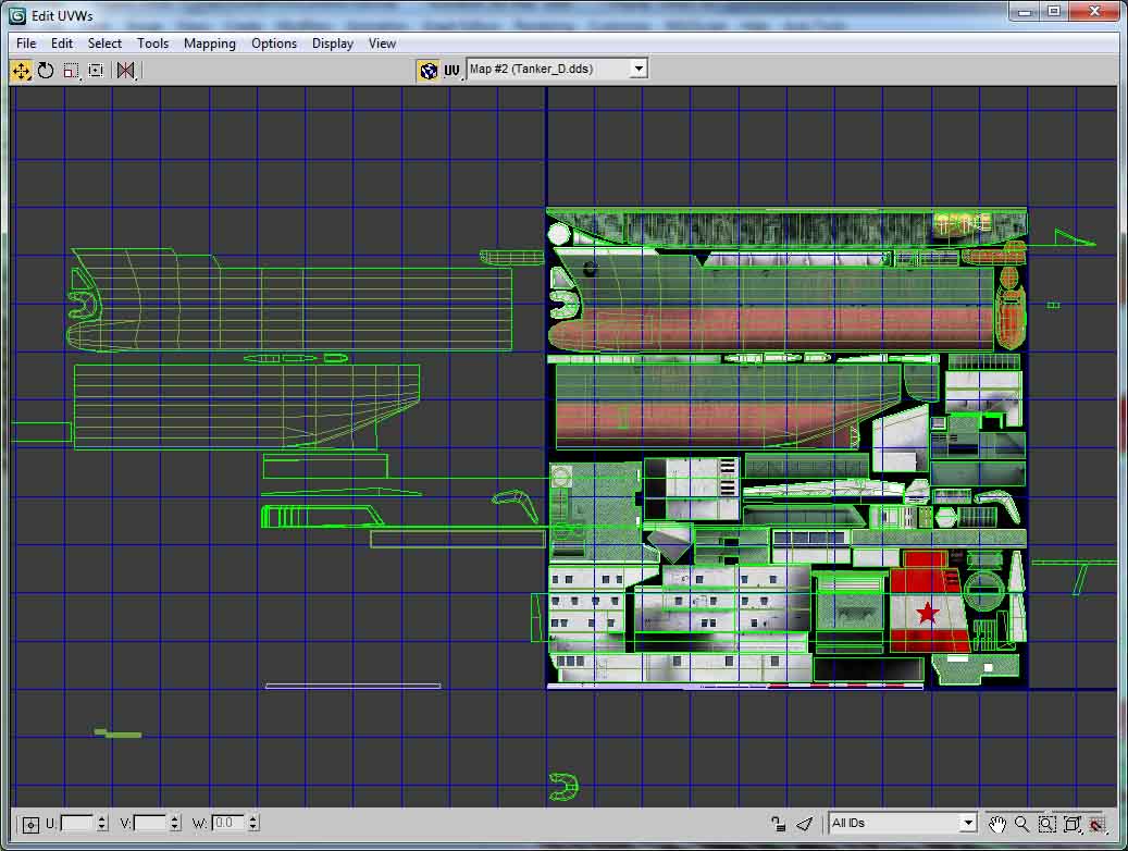
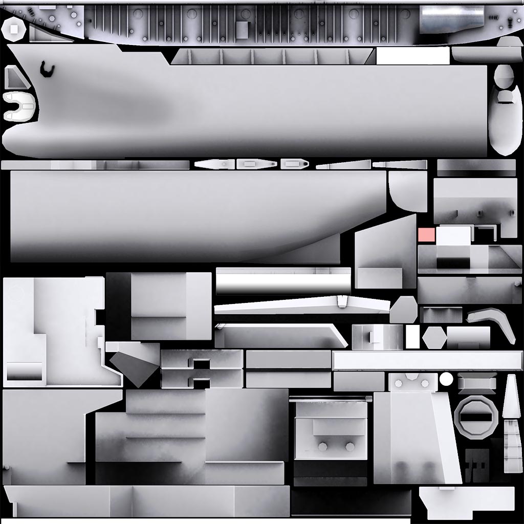
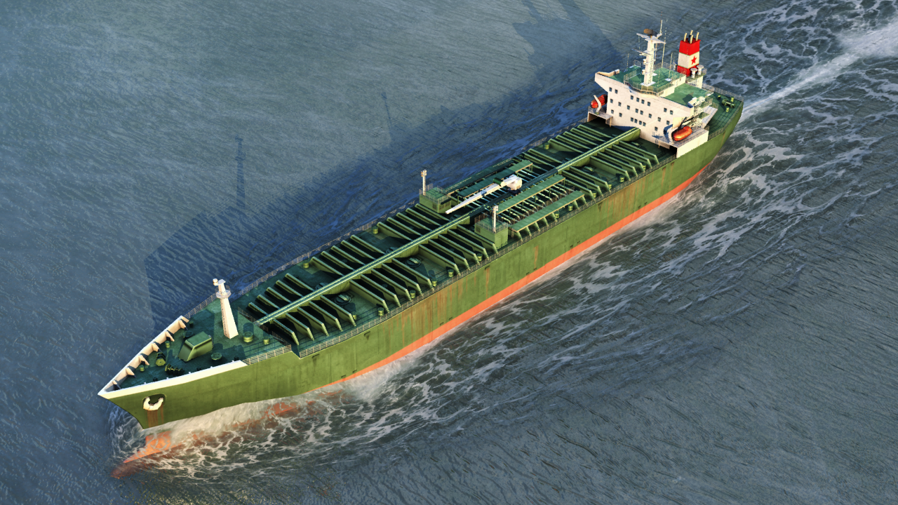
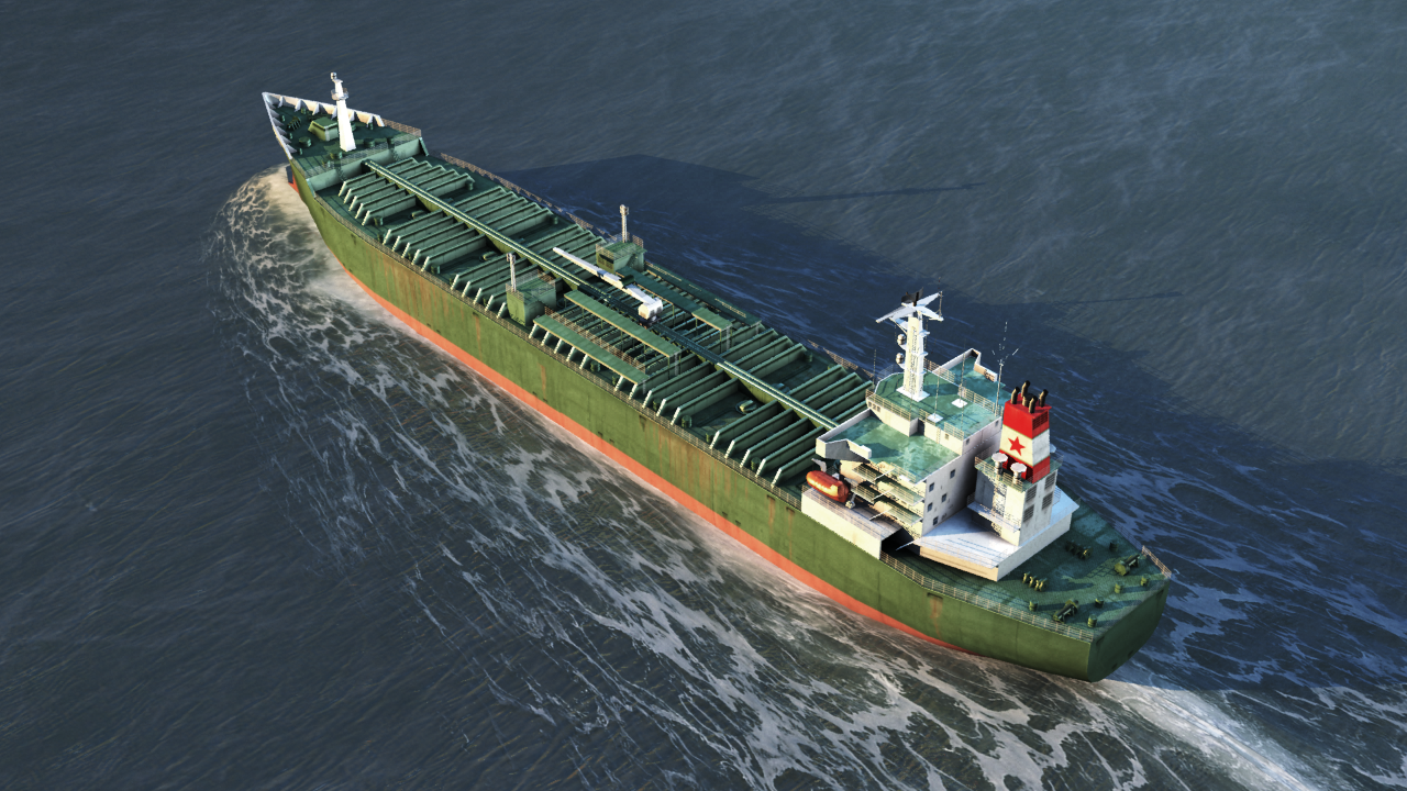
Looks better for sure but it's not difficult to set up a bake. The way I usually do it is copy all my objects and attach them together into one mesh, give it a white phong material and render out a lighting map with lighttracer and a skylight. It will render separate maps for separate objects so you have to group your meshes by UVs, and also make sure you don't have overlapping UVs. That's not to say you can't mirror stuff - you can do that but the mirrored UVs have to be moved away from 0-1 space. I too used to handpaint all my shading but outside of doing handpainted styles there is little point to do so when Max gives a much better and accurate result and does it faster. Sure, it takes some effort to learn how to get it right but as with everything else in life the payoff is usally worth the effort :) Attached is my UV layout on a tanker where you can see I've offset stuff and the resulting bake and some pictures from Marmoset so you can get an idea of what I mirrored and where. If you build the model with mirroring UVs in mind it's generally much easier to do things. For example this tanker (like most ships tbh) is very symmetric so I only built half of it, mapped it, and then baked it with along with a dummy copy to give the correct shading. I did the same for the Kresta 2.
-
I would bake those harpoon launchers if I were you. And change those windows on the bridge to ones that don't look as cartoony. Otherwise it looks better than your earlier efforts :)
-
I think it resembles a Vigilante seen from above :P
-
I know you're insinuating the Tu-160 is a copy of the B-1B, but what's funny about that is that the TU-160 from a design perspective is in no way related to B-1B. Simply looking at similar planform and saying "that's a copy of that" is silly. The designs look similar because they're made with the same basic requirements in mind. There's only so many ways of designing an effective variable inlet engine nacelle, or VG wing. Interestingly, apart from general layout, in almost every other aspect, they are different from one another. The actual "daddy" of Tu-160 is Myasischev M-18, which looks much more like the final 160 than NAA's winning 1970 B-1 design: And I don't see how the SU-24 looks anything like the F-111 except both are VG aircraft and have side by side cockpits. Especially since Su was originally designed as a fixed-wing aircraft. Again, in almost every aspect apart from general planform, they are different from each other. Might as well say the TSR-2 looked just like the RA-5C. How about some planes that really do look like one another? Lockheed Tristar: Douglas DC-10: Boeing 727: Tupolev 154: Ilyushin Il-62: Vickers VC-10: I was going to post the Concorde and Tu-144 too until I realised they don't really look the same at all, except for both being supersonic deltas :(
-
CIWS on ships in SF2:NA and/or merged.
Julhelm replied to KJakker's topic in Mods & Skinning Discussion
Sometime in the future I'm gonna make a Kirov of my own. For now I think I'll focus on landing and support vessels. -
By that metric, all the migs are targets you fly past at mach 2, so there is no point to have them modelled or textured since that is only going to affect framerate.
-
Meh, I can build a Kotlin. Already have all the parts needed for it, just need the time.